Context
NYT customer care agents handle high volumes of cancellation and plan-change requests where speed and clarity directly influence retention.


The New York Times · Customer Care · 2023–2024
Our goal was to simplify the process by which agents find and narrow down retention offers for customers, increasing the likelihood of subscription retention and ensuring a better interaction between agents and customers.
NYT customer care agents handle high volumes of cancellation and plan-change requests where speed and clarity directly influence retention.
The existing Product Switch flow was fragmented and cognitively heavy, making it difficult for agents to choose the right retention offer during live calls.
Simplify selection, reduce unnecessary steps, and surface high-value offers faster so agents can retain more subscribers with less friction.
The engagement followed a full product-design cycle, with each phase anchored to reducing agent effort while preserving business retention goals.
Understanding the Problem with the Subscription Modification Flow
To uncover the root of the problem, I delved into previous research conducted on this topic. Various teams within the Growth mission at The New York Times have explored this issue from different angles, with their primary question being:
How can we improve customer retention by offering the best upgrades to entice customers to maintain their subscriptions?
While I care deeply about the customer experience, I recognize that it is intrinsically tied to the agent's experience. Therefore, I chose to focus on understanding the agent experience, particularly the issues they face while navigating the Subscription Modification flow to select the best upgrade offers for customers. Here are some of the key questions I aimed to answer:
Here are the main issues agents find with the current subscription modification flow, uncovered after reviewing existing research:
While on a call with a customer, agents must quickly read through a list of retention offers, assess which one will be most effective for the customer, and present it persuasively, all in real-time. This often leads to longer call durations and delays in assisting customers.
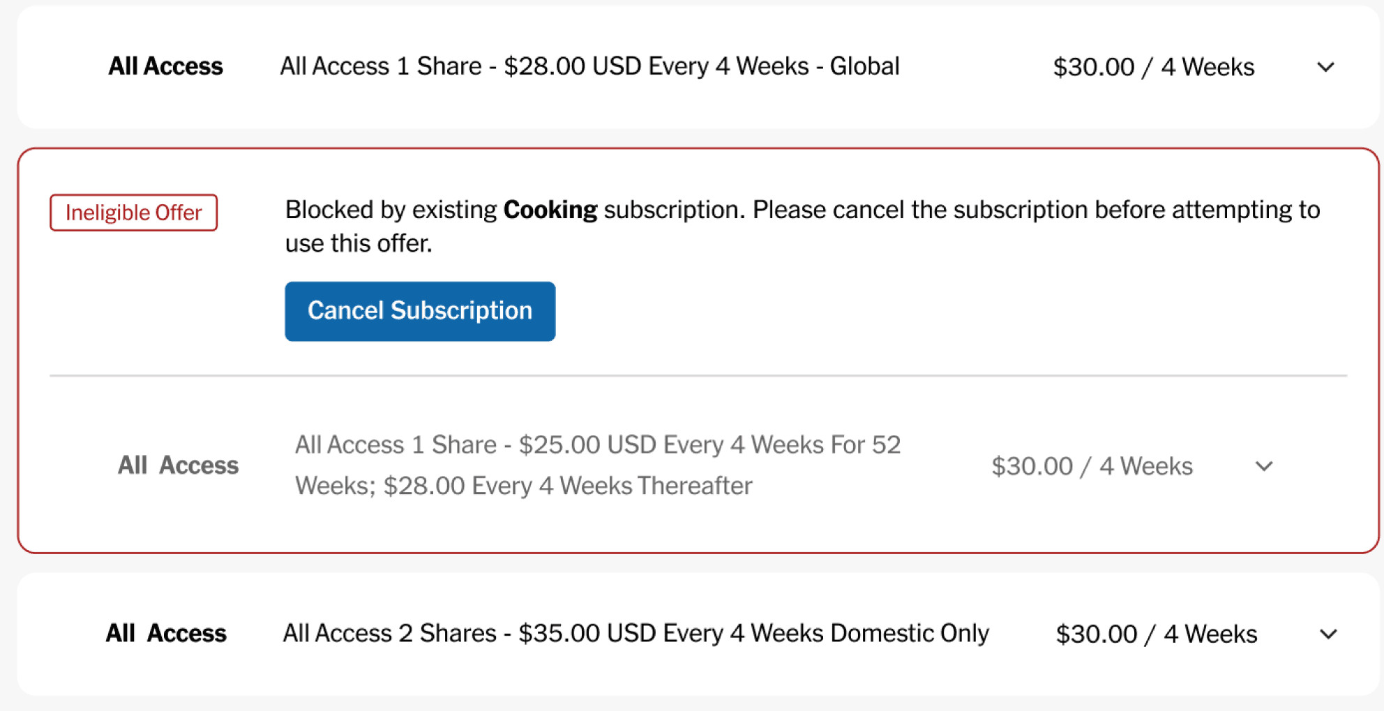
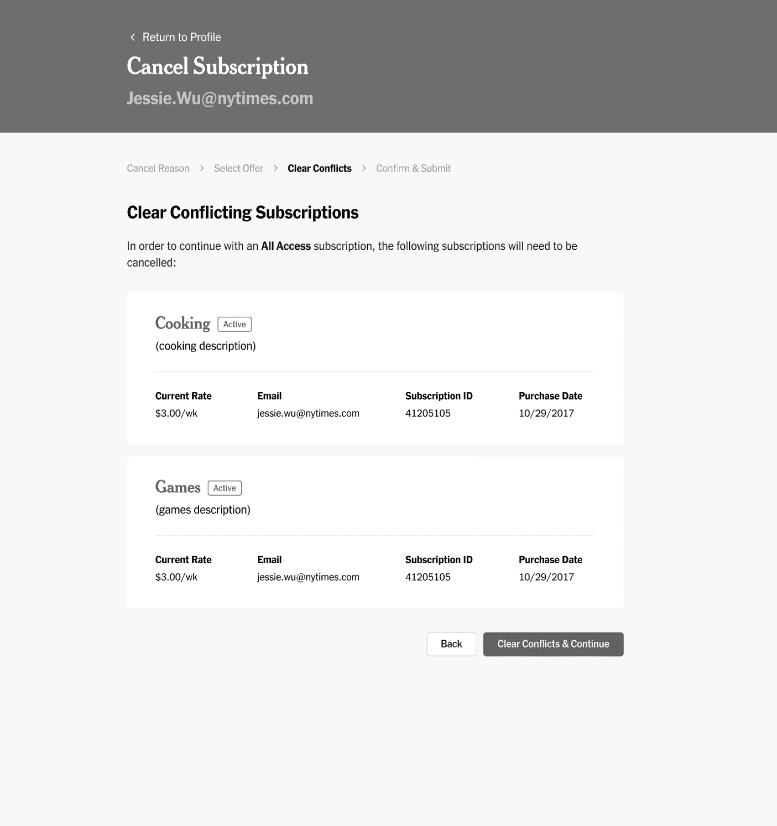
Customers sometimes have existing subscriptions that must be removed before an agent can select another retention offer. This usually means that agents are required to navigate out of the Subscription Modification flow, return to the customer profile page, and cancel the existing subscriptions before being able to proceed.
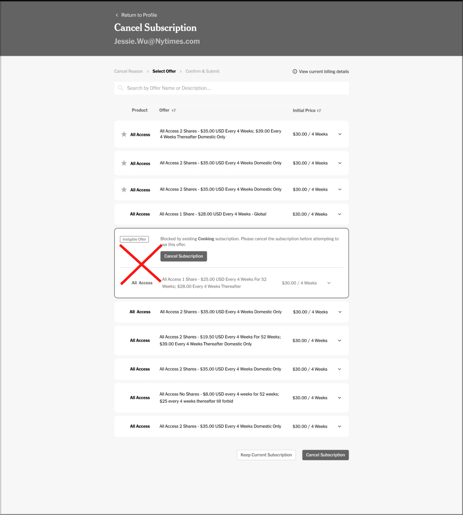
Customers are often ineligible for certain subscription upgrades based on their current subscription type. Despite this, these ineligible offers are still displayed to agents, even though they cannot be selected. This leads to congestion in the available choices, further complicating the decision-making process.
I mocked up designs that I thought would best address the issues we identified. Here are the goals I aimed to achieve with these new designs:
While exploring various design iterations, I gathered feedback from different designers on how to optimize the offer selection process for agents. We were torn between two main designs: one that redirected agents to another page to select an offer, and another that allowed them to select an offer on the same page. To determine the best approach, I decided to conduct user testing with agents.
To gather data on the agents' preferences for the two designs, I conducted guerrilla-style usability testing to efficiently collect feedback. I created two prototypes and presented various tasks requiring agents to use the product switch flow to complete them.
Select offer on same page

Select offer from different page

“I liked having the offer on the first page as opposed to going to a new one. I like that you can still see the other offers, while looking at one in more detail. Makes it easier to switch if necessary.”
Agents found the first offer selection flow to be most intuitive, therefore I decided to focus on finalizing that design.
Due to product prioritization and roadmapping efforts, the team decided to put this work on hold and focus on other features. This past spring, we resumed work on the designs, aiming to further simplify the offer selection flow for agents.
We also now have access to new technology that will allow us to surface only the best value offers to agents. This means that agents will no longer have to choose from a list of more than five offers at a time.
I revisited the designs with a fresh perspective, focusing on two key questions:
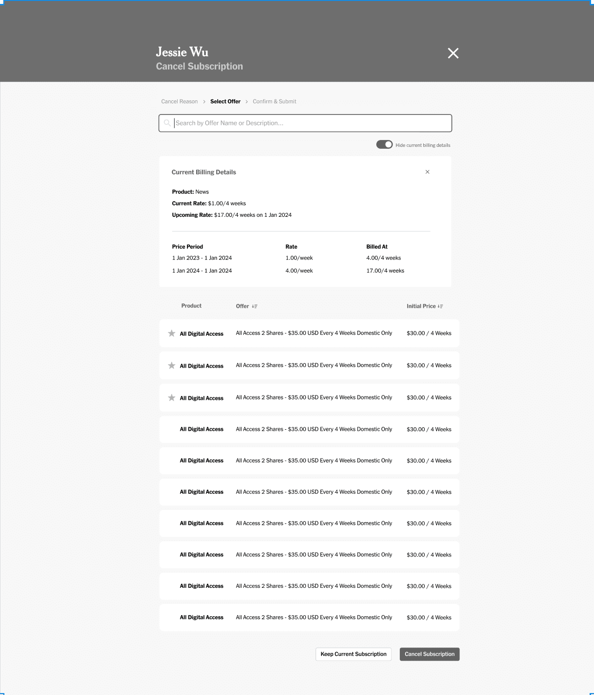
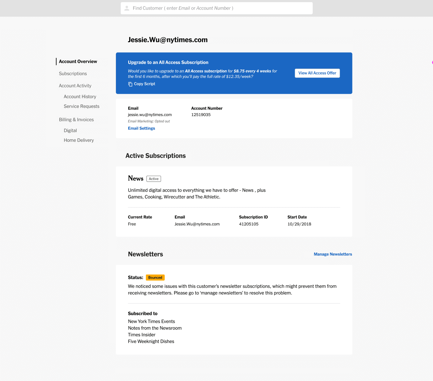
To support a new focus on increasing agent-driven upsells, we added a banner to the Account Overview page on the customer's profile. This banner alerts agents when a customer is eligible for an All Access upgrade offer, making it convenient for agents to launch into the offer selection flow without needing to be on the Subscription Details page.
Hover over the numbered markers to explore annotations
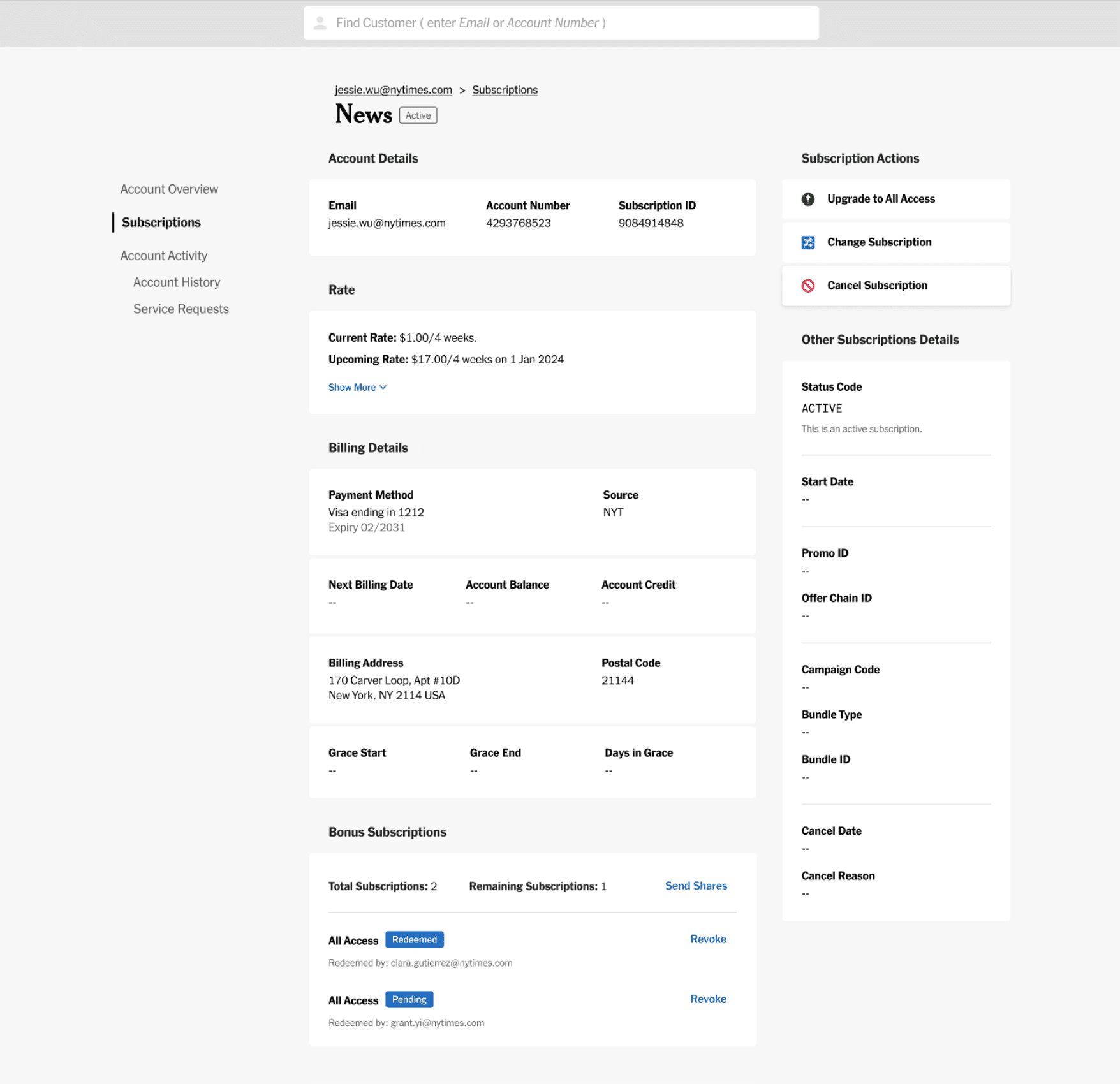
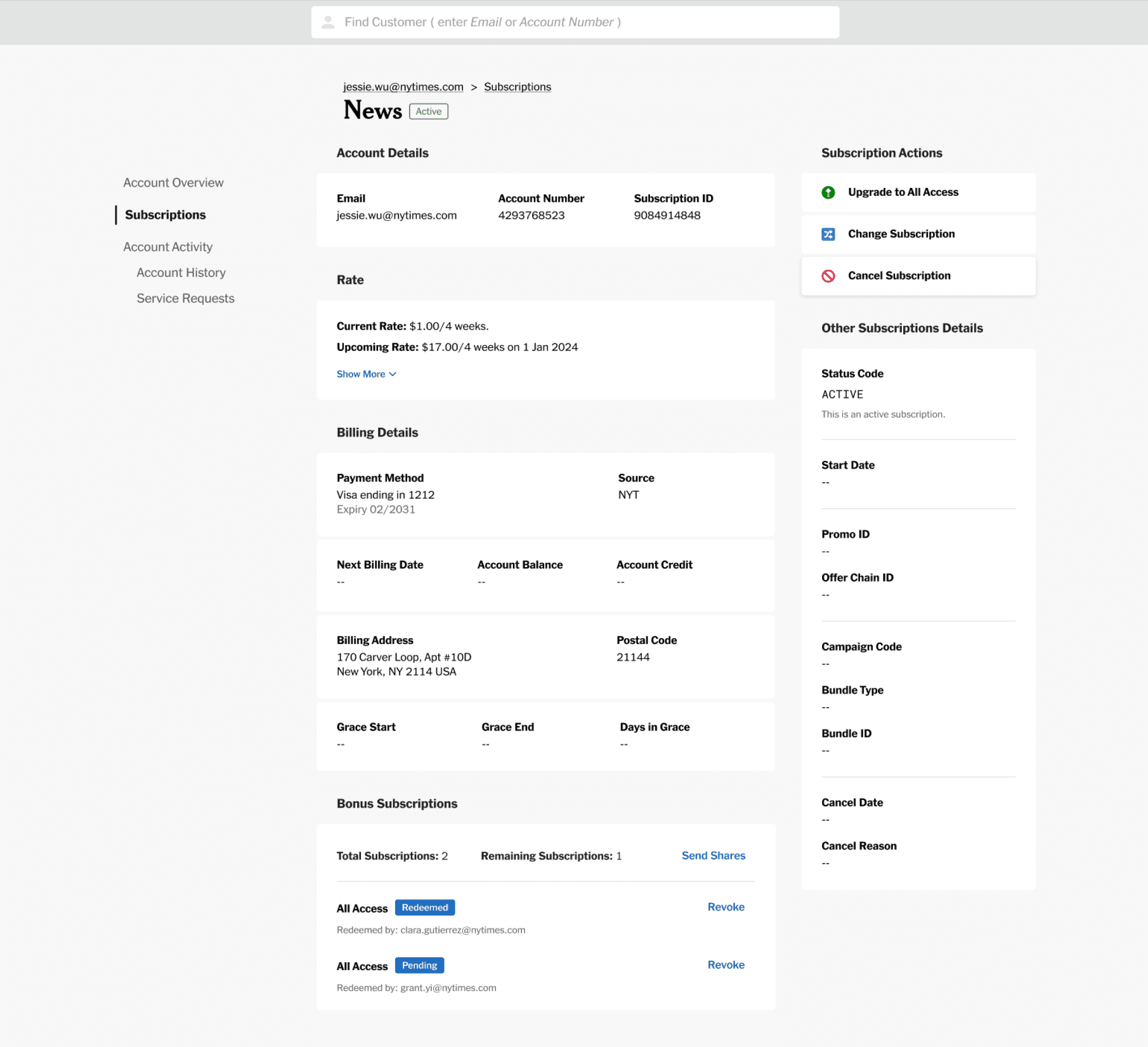
To streamline navigation and enhance user experience on the subscription detail page, we've added distinct buttons for specific actions. These buttons immediately guide users to subscription upgrades, lateral product changes, or subscription cancellations.
Hover over the numbered markers to explore annotations
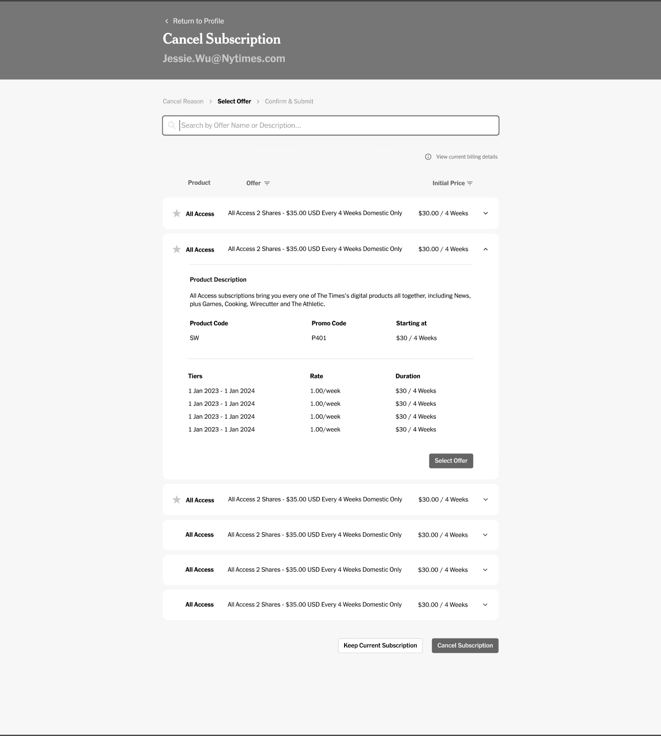
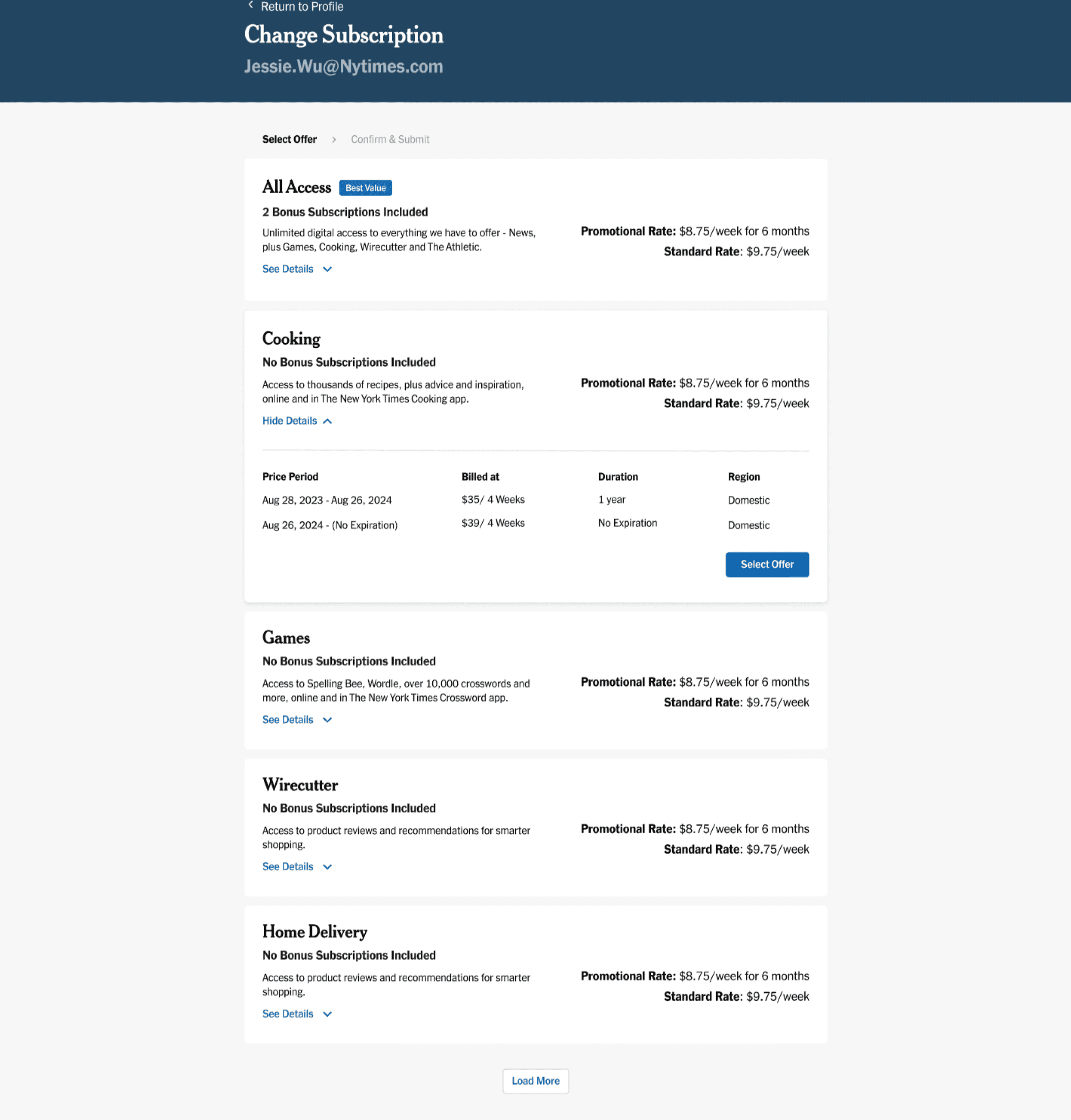
We're showing a “Best Value” status next to the best subscription to differentiate it from the other available offers, and make it easier for agents to know which offers they should present to customers.
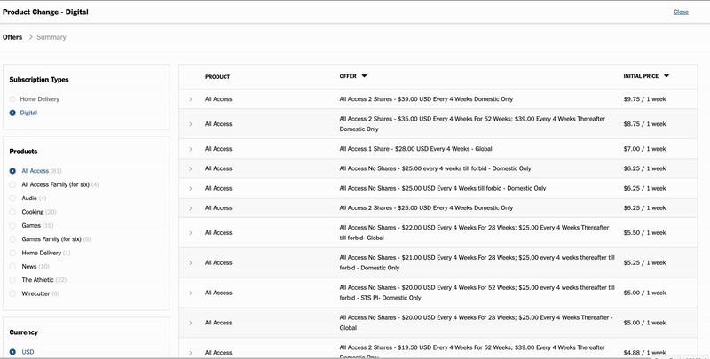
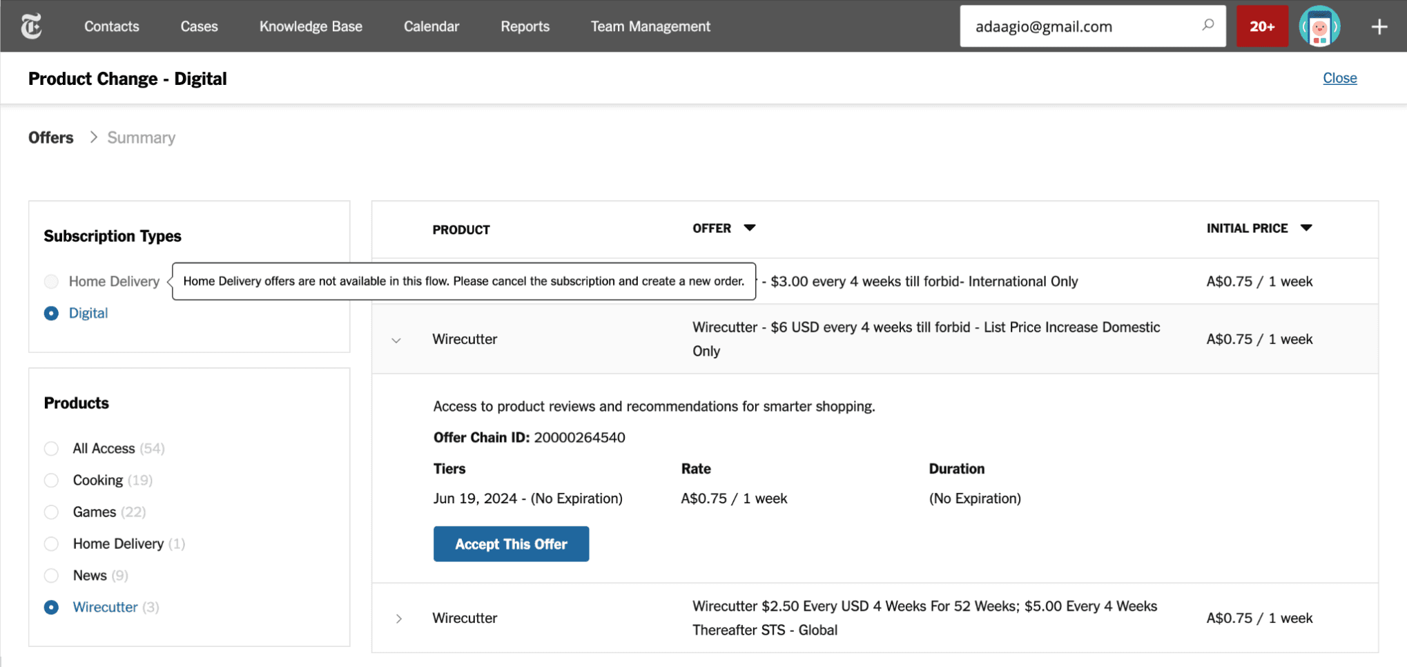
In the previous iteration, I used a table to display the available offers because we were showing a longer list. Now that we are only showing a few offers at a time, I created more compact cards that highlight the most necessary information upfront and reveal additional details upon request.
Hover over the numbered markers to explore annotations
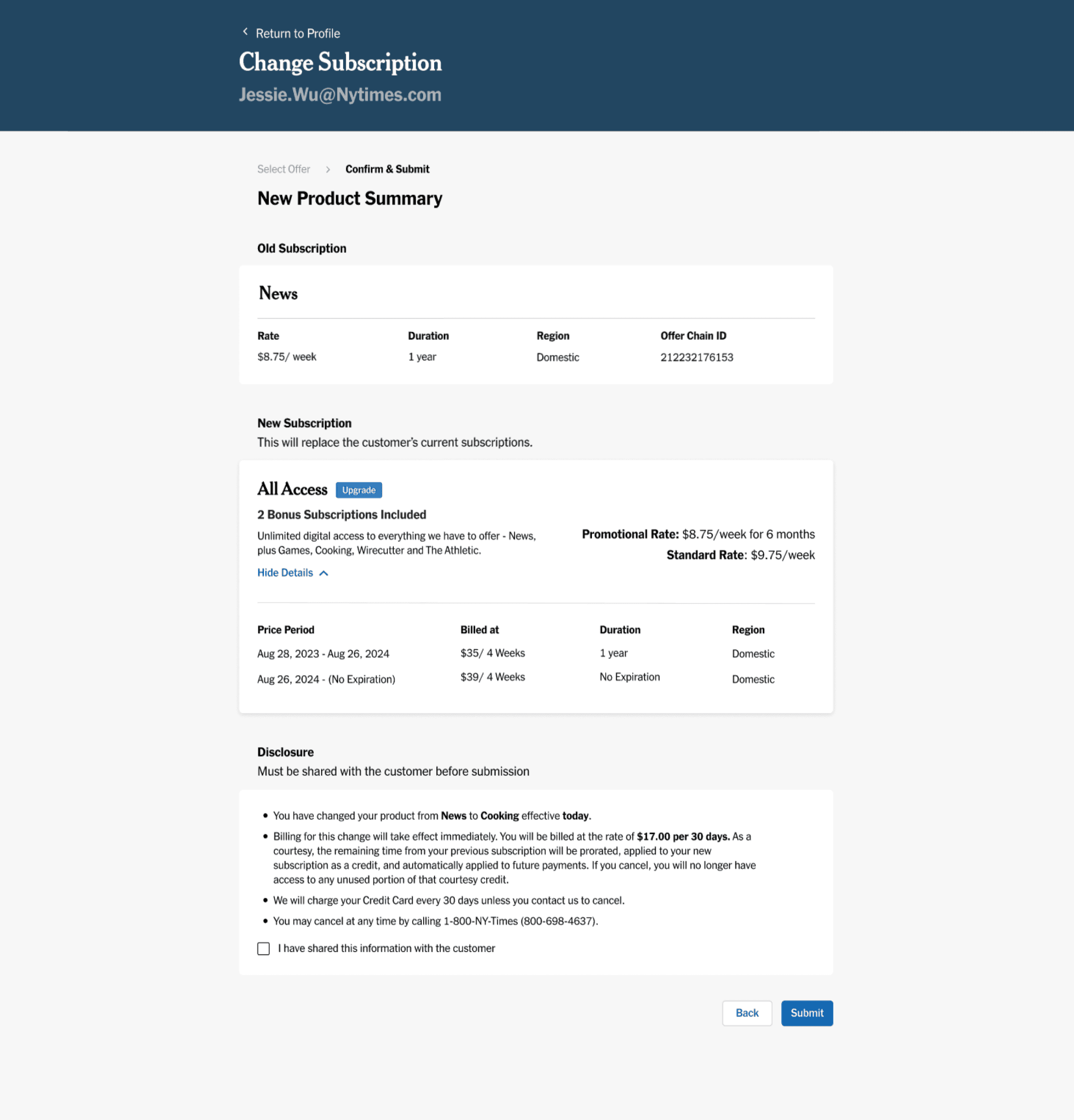
In the previous iteration, agents were redirected to a separate page to confirm the cancellation of a customer's existing subscriptions before proceeding. I have now consolidated that information into the “New Product Summary” page to reduce the number of steps agents must go through.
Hover over the numbered markers to explore annotations
During the visual quality assurance (VQA) process, I collaborated closely with engineers to ensure alignment between the designs in Figma and the implementation in staging. This involved logging into the staging account and using the inspect tool to closely examine the specifications of the design elements. I annotated any discrepancies I noticed, so that engineers could make necessary adjustments. This iterative process helped ensure that the final product closely matched the intended design, enhancing consistency and visual quality across the platform.
After implementing the redesigned Subscription Modification flow, we observed meaningful improvements in key metrics that reflect both agent efficiency and customer satisfaction: