Context
The New York Times offers complimentary products during cancellation to reduce churn, but the experience was not personalized and often felt generic to subscribers.
The New York Times · Consumer Product · 2023
Make personalized save offers easier to understand and more relevant in the cancellation moment, so subscribers recognize real value and fewer viable relationships end in avoidable churn.
The New York Times offers complimentary products during cancellation to reduce churn, but the experience was not personalized and often felt generic to subscribers.
Subscribers undervalued offers when product relevance was unclear, leading to avoidable cancellations and weaker retention outcomes.
Use engagement-informed recommendations and clearer offer framing to make personalized offers feel more meaningful, timely, and worth keeping.
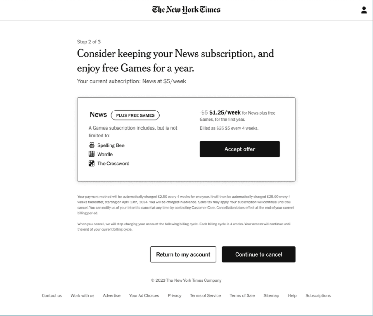
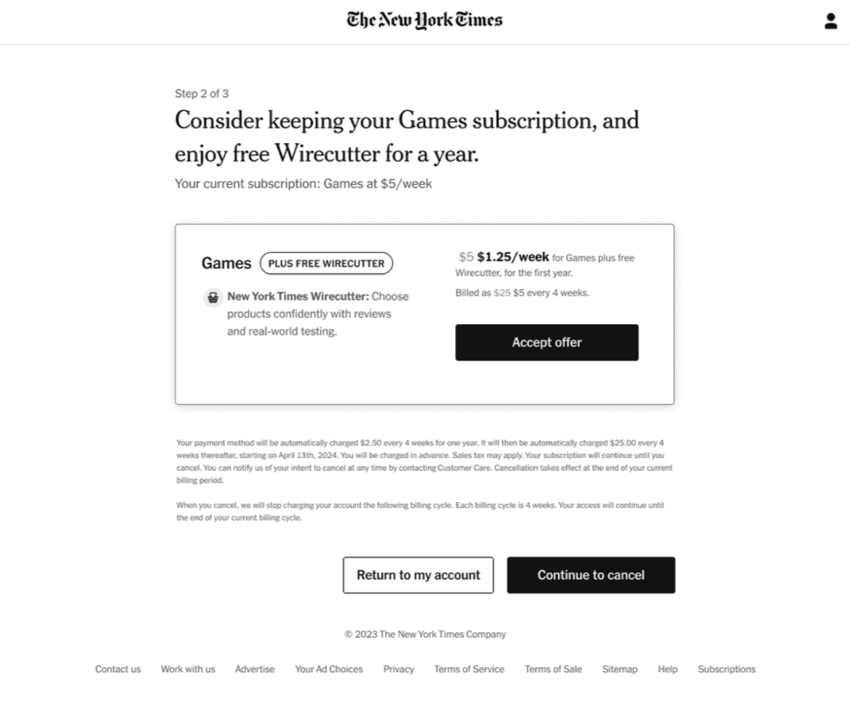
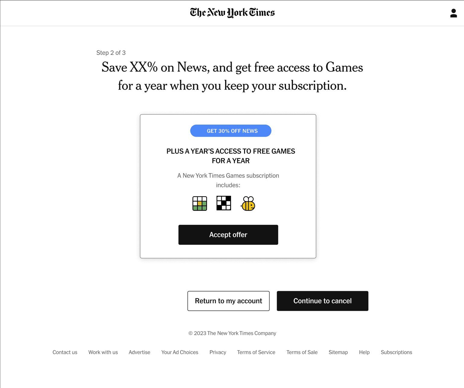
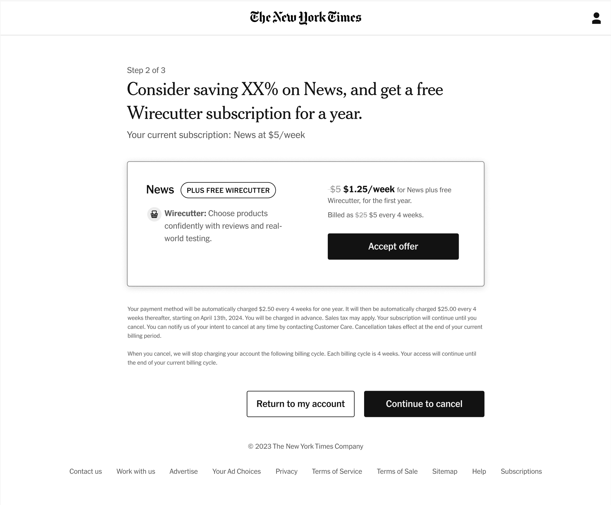
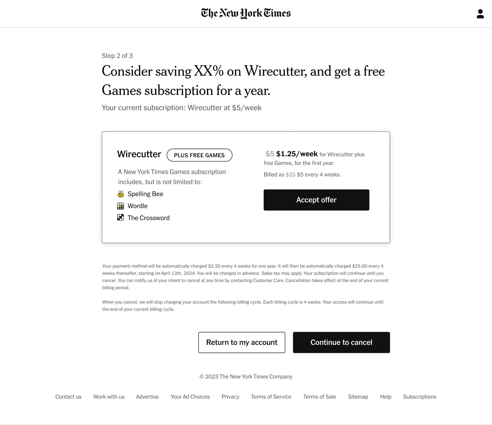
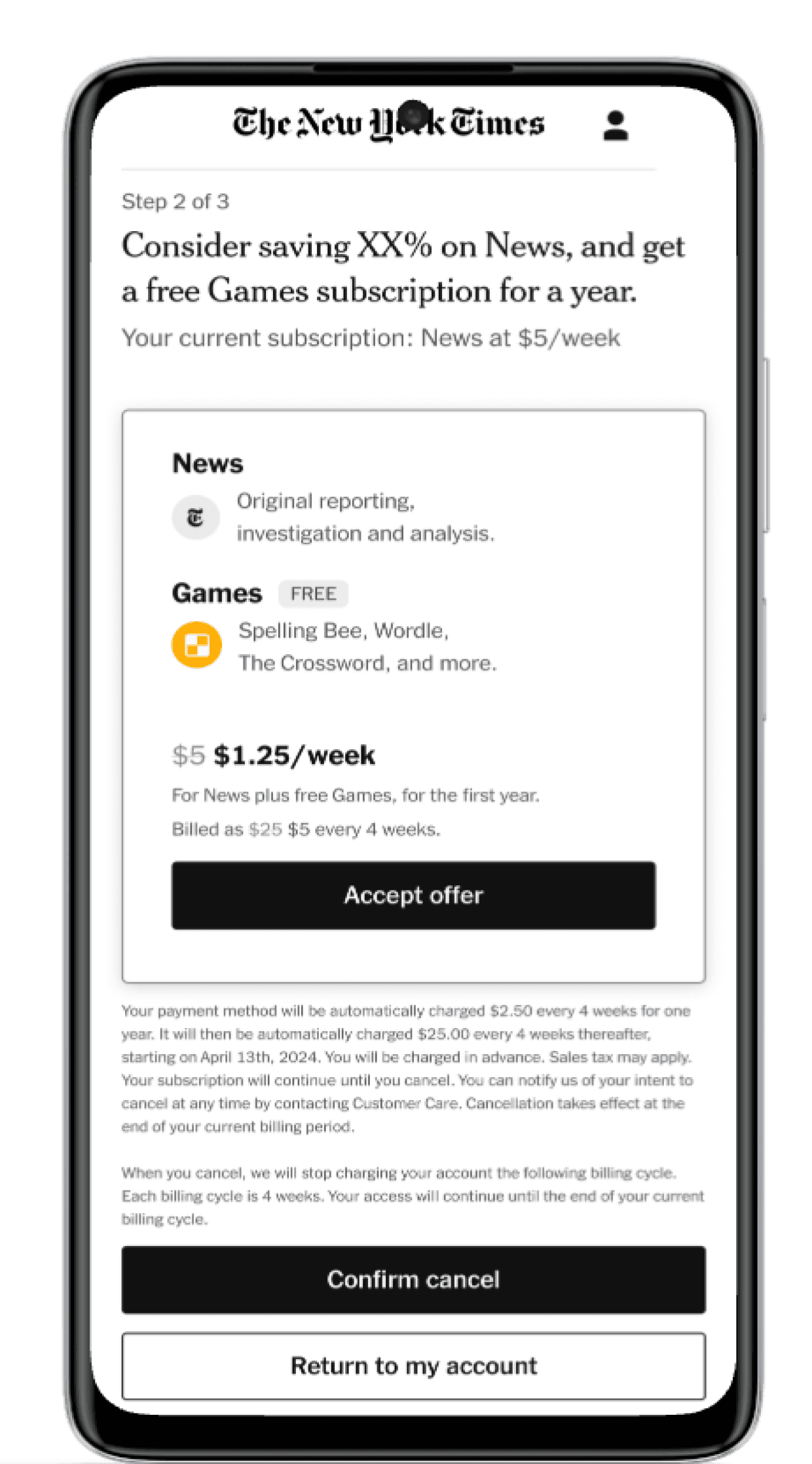
When a New York Times subscriber initiates a cancellation, the platform has one last opportunity to retain them: a "save offer" page presenting a complimentary product, Cooking, Games, Wirecutter, as a reason to stay. The ADG team had been running this flow for some time, but the offer-acceptance rates weren't where they needed to be.
The problem wasn't the offers themselves. The research team had already surfaced a critical insight: subscribers were dismissing valuable complimentary offers because they couldn't imagine using them. An offer for Games meant nothing to someone who'd only ever read news. A Cooking subscription landed flat for someone who'd never opened that section.
The goal was never to trick someone into staying. It was to make the right product visible to the right person, so they could see, in that moment, that leaving meant giving something up.
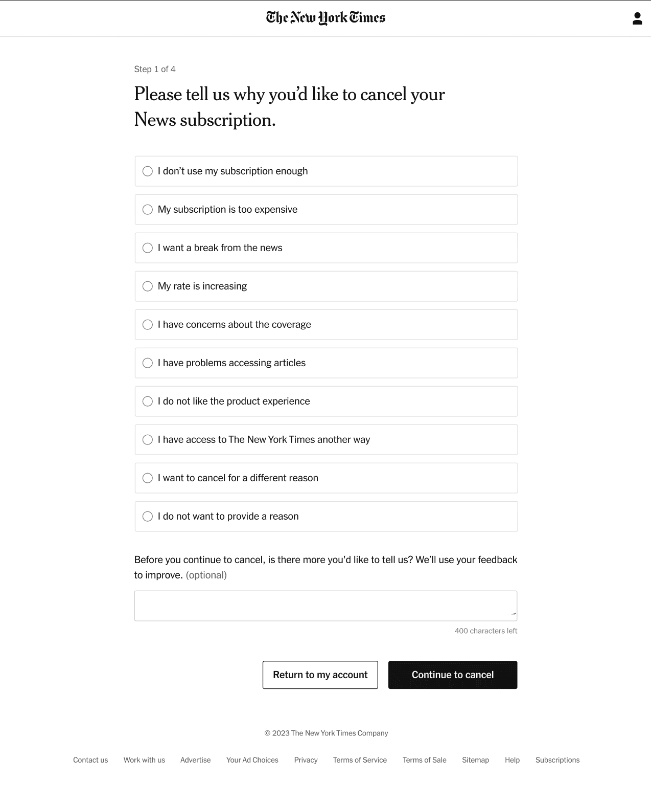
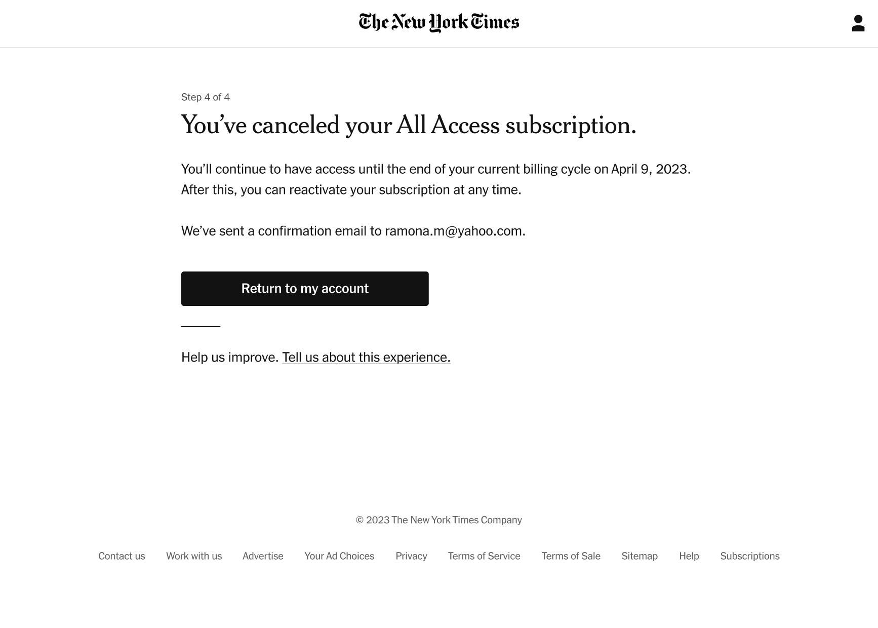
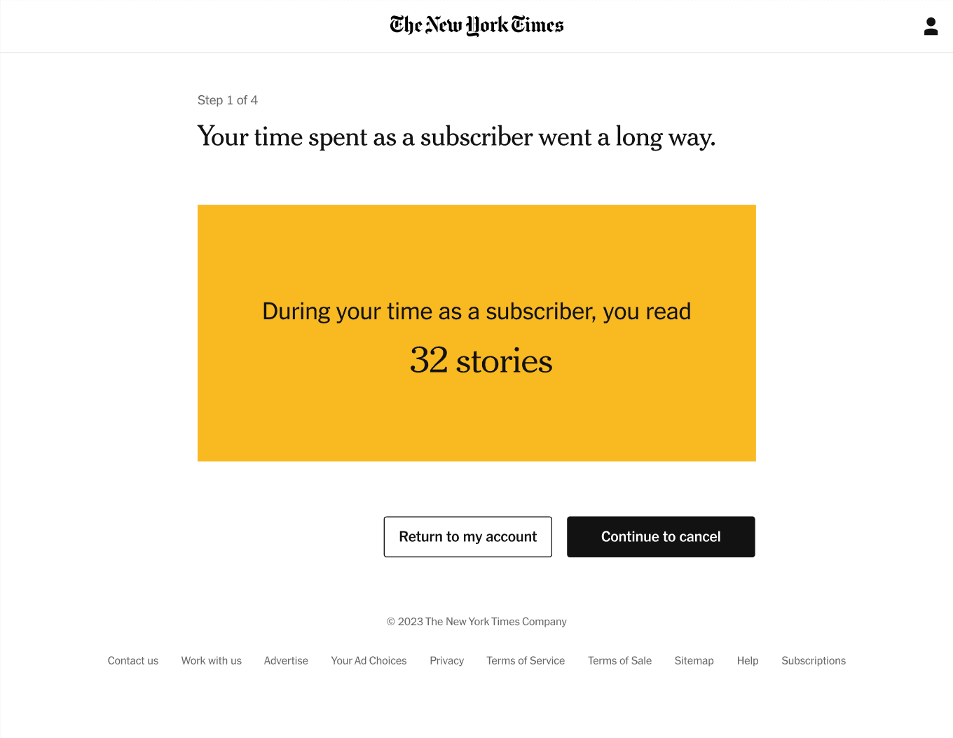
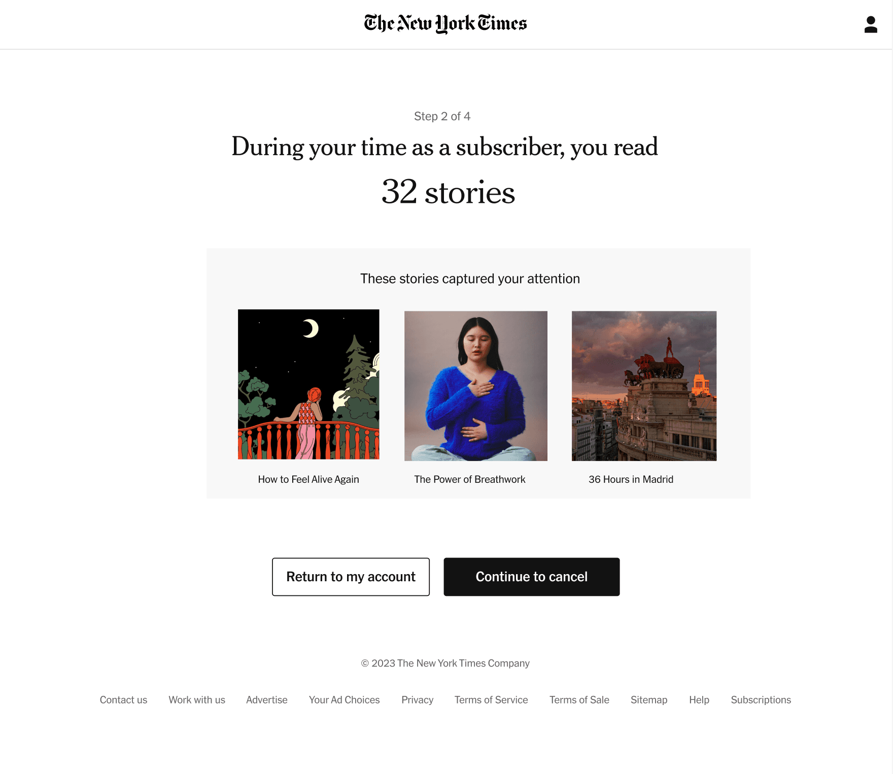
The current cancellation flow took subscribers through four screens before presenting the save offer. Each step was functional but generic, the same message regardless of whether you were a crossword devotee or a daily news reader.
Step 1
Step 2
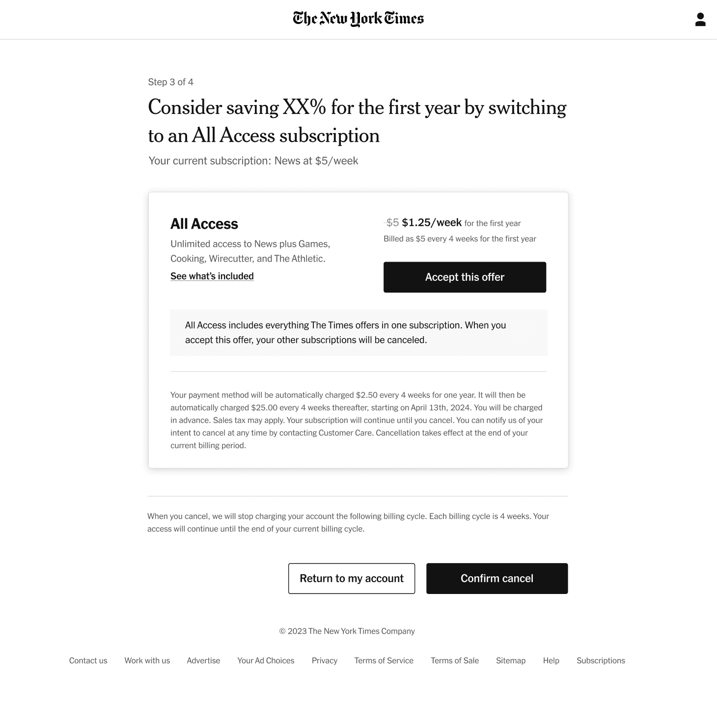
Step 3
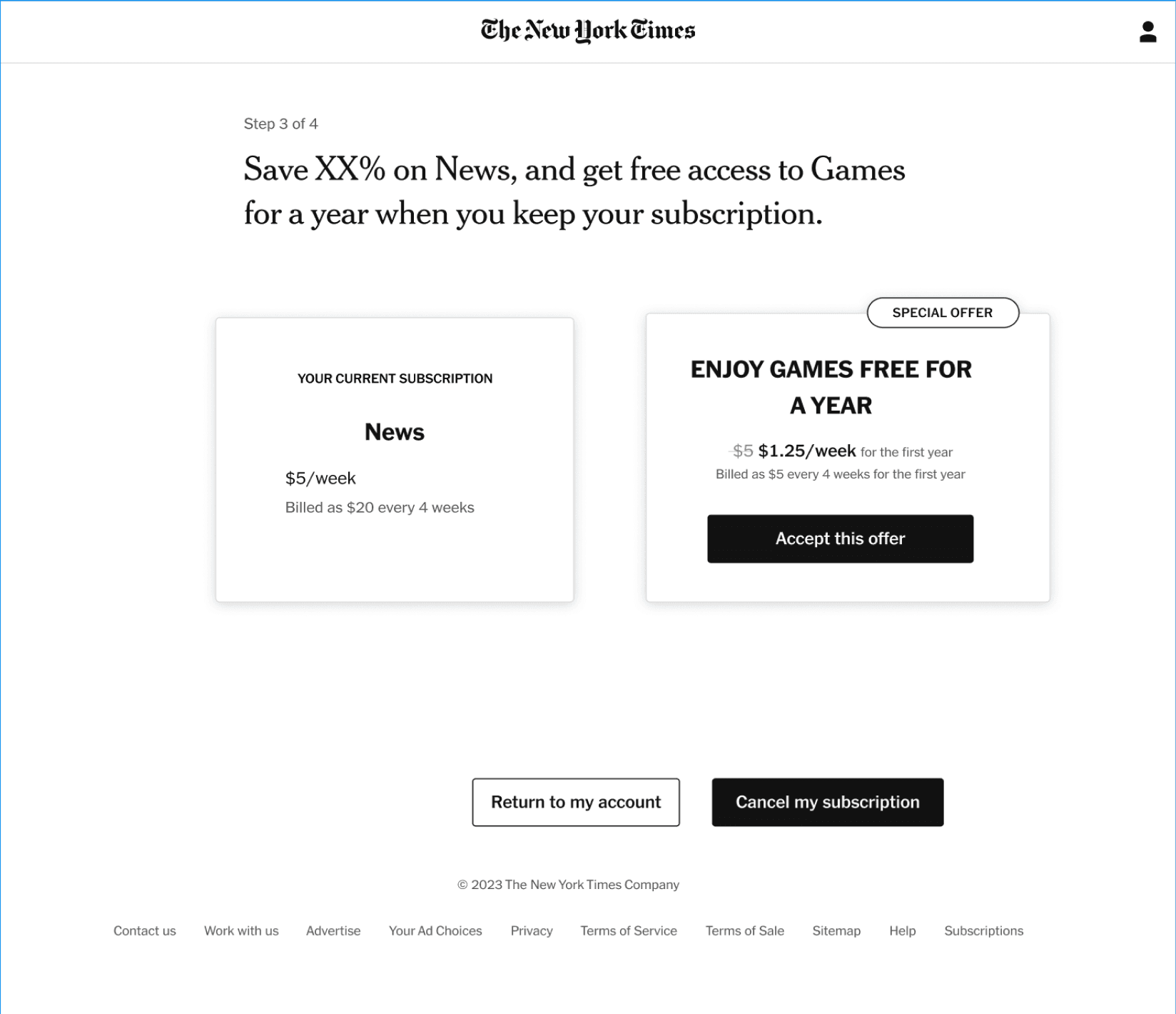
Save Offer
The Audience Insights team had already done the foundational work. In unmoderated research sessions with 19 Times readers, they surfaced a clear pattern: offers were being rejected not for their objective value, but for their perceived relevance. When a subscriber couldn't recognize themselves in the offer, they dismissed it.
Readers shown offers for products outside their usage patterns consistently rated the perceived value lower, even when the products were objectively worth more than their subscription. The problem wasn't the offer. It was the match.
Working with the Machine Learning team, we could surface offers based on actual subscriber behavior, what sections they read, how often, what products they'd already engaged with. The data was there. The design just needed to use it.
Unmoderated session findings, subscribers rating offer appeal by perceived relevance
With the research grounding the work, I developed four design principles to guide the redesign. Each one targeted a specific gap between how the offer was currently presented and what subscribers needed to feel the value.
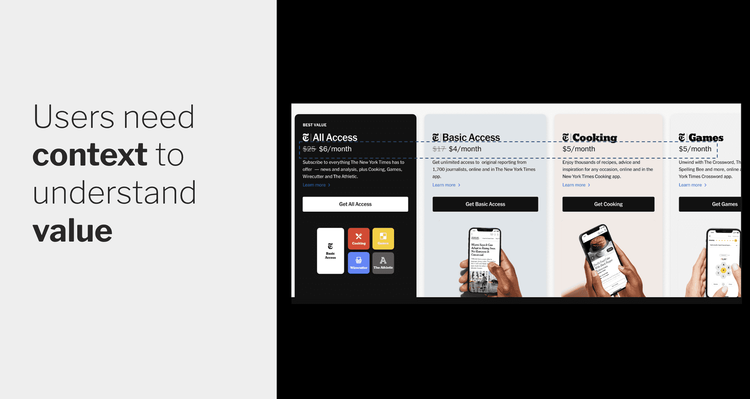
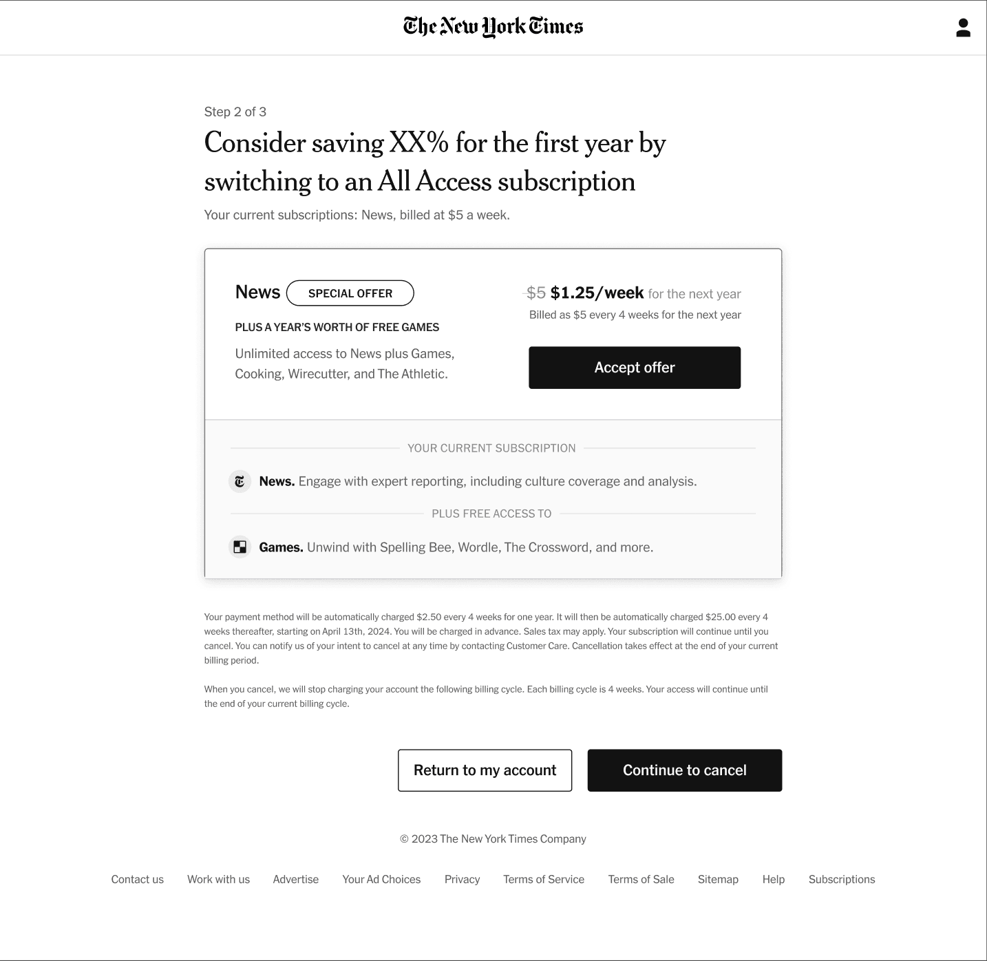
NYT sub-brand icons, Crossword, Wordle, Cooking, carry strong recognition. Using them instantly signals what the offer is, before the subscriber has to read a word of copy.
A "Special Offer" label distinguishes a complimentary offer from a discount, and creates appropriate urgency without feeling manipulative. The offer is genuinely scarce, design should reflect that.
Subscribers hesitated when they weren't sure whether "free" meant free. Displaying the retail price of what they're getting, and making "Free" explicit, removes that ambiguity entirely.
Iconography and product descriptions should help subscribers project themselves into the product. Not just what it is, but what using it actually feels like day-to-day.
Each direction tested a different combination of the four principles, varying how prominently to feature sub-brand icons, how to express pricing, and how much space to give product descriptions.
Four directions: icons and framing, urgency messaging, pricing clarity, and lifestyle imagery for everyday use.
Before subscribers even reached the save offer, there was an opportunity to prime them: a Value Proposition page that surfaced personalized engagement data, how many stories they'd read, what sections they frequented. My hypothesis was that grounding the offer in their own behavior would make the retention feel earned rather than generic.
I explored three directions for this page, each varying how prominently to feature the engagement data and how directly to connect it to the offer they were about to see.
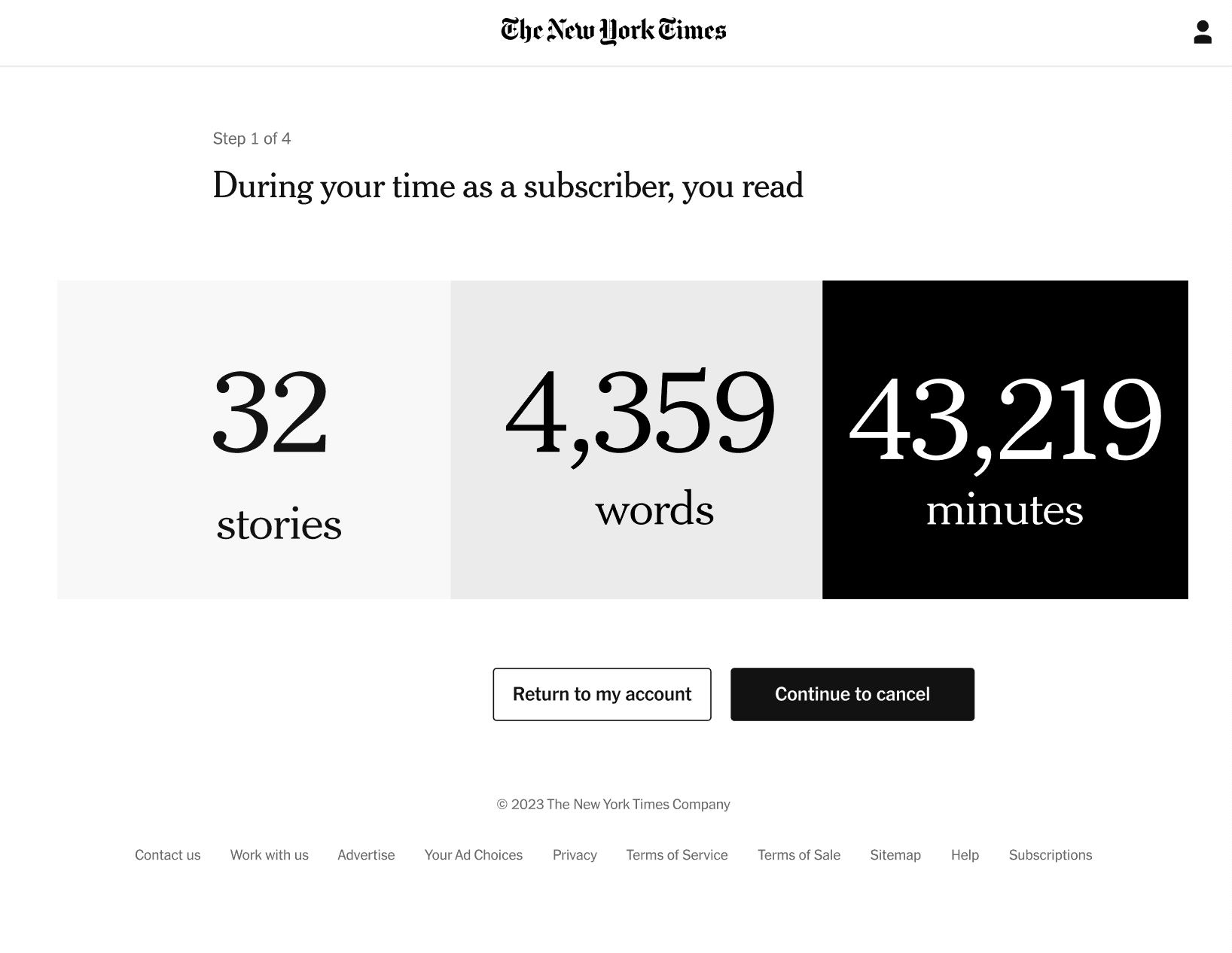
Three explorations of the Value Proposition page, each surfacing engagement data at different levels of prominence
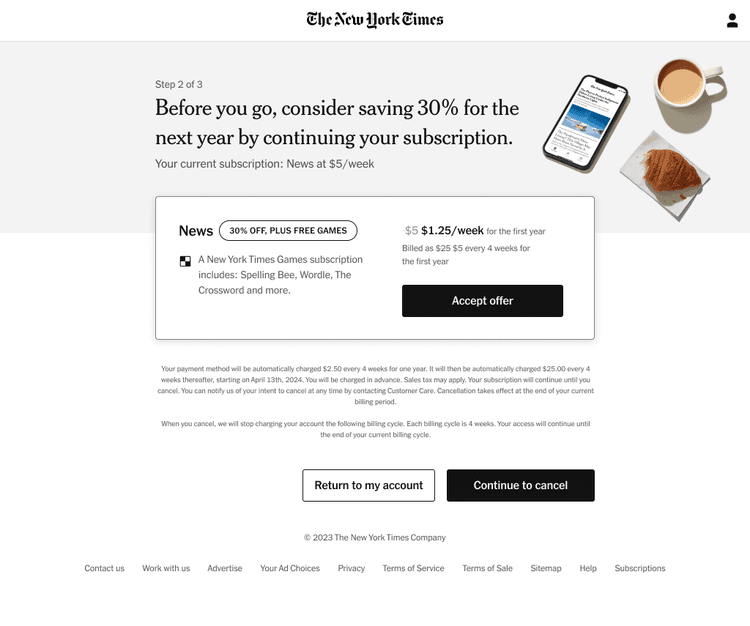
This is where the project got complicated. The page tested well internally, but legal requirements meant we couldn't add steps to the cancellation flow. The value proposition page had to go.
Rather than losing the personalization intent entirely, we integrated the core idea directly into the save offer page itself. The engagement signal moved from its own screen to contextual copy within the offer, preserving the value without the extra step. A constraint that forced a cleaner solution.
The final save offer page brought together all four design principles, now tightened by the legal constraint that removed the value proposition page. Every element on screen had to earn its place, there was no upstream page to prime the subscriber. The offer itself had to do all the work.
Hover over the numbered markers to explore
Hover over the numbered markers to explore
Hover over the numbered markers to explore
We ran a variant test over one week. The control group saw the original cancellation flow; the variant saw the redesigned save offer page with all four improvements applied. The primary metric was save rate, did subscribers in the variant group choose to stay at a meaningfully higher rate?
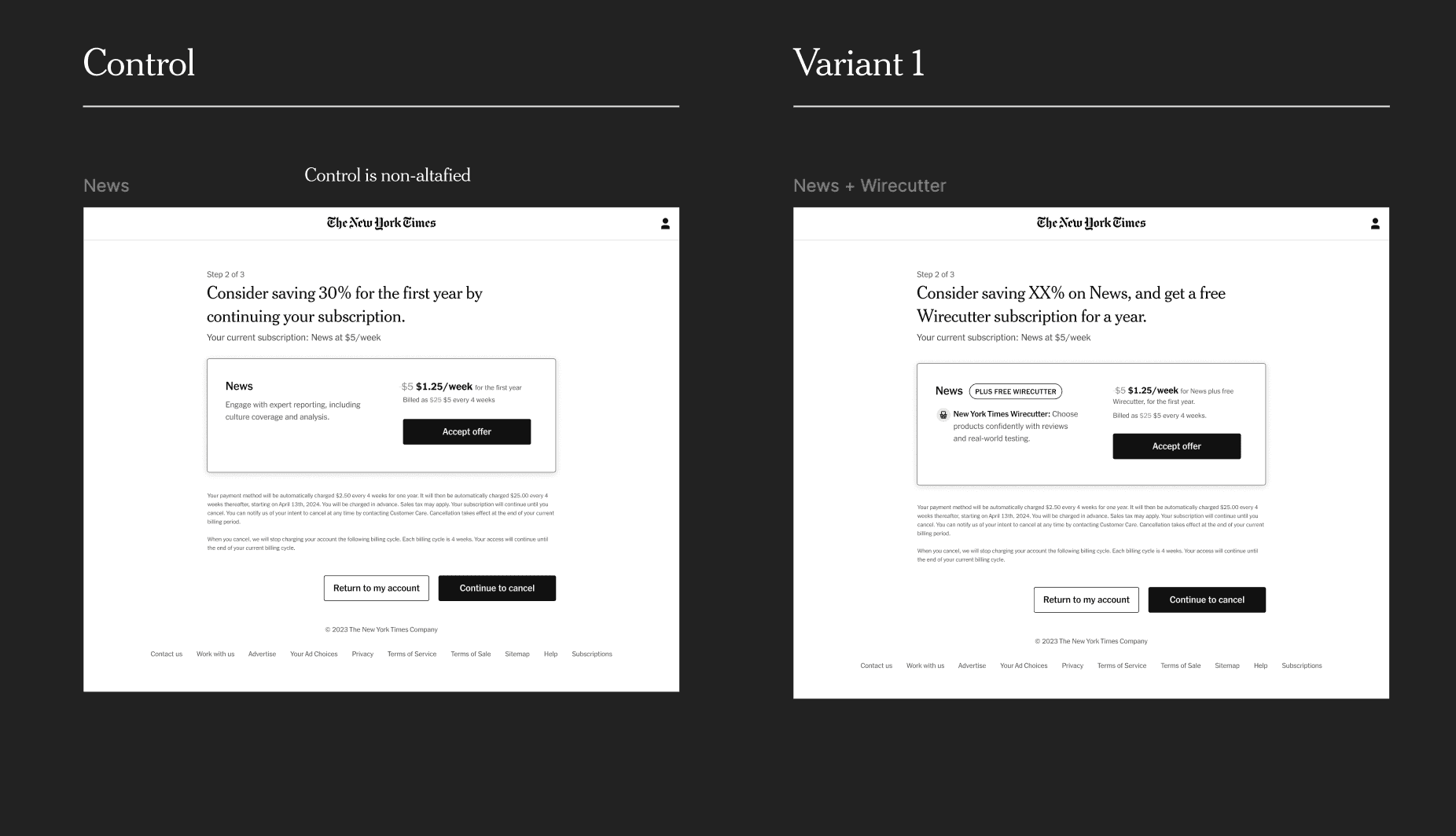
Variant test, control vs. redesigned save offer page, measured over one week
The test confirmed the hypothesis. Subscribers in the variant group accepted the personalized offer at a significantly higher rate, driven by three specific changes: the clearer price expression, the urgency messaging, and the more prominent product associations. The personalized data angle, though constrained to in-line copy rather than its own page, still had a measurable positive effect.
Losing the value proposition page felt like a setback. But integrating engagement context directly into the offer copy produced a tighter, less fragmented experience. The constraint forced a solution that was actually better, one screen instead of two, with no drop in personalization signal.